editingphoto
RocketChat ID: WzE8NPPkTgDT2RWsQ
135 total messages. Viewing 100 per page.
Page 1/2
| Next
I don't believe so, but Jesse will confirm.
No major changes to the process. Let's catch back up on these edits!
Hell yeah
Let's do it
Was there a particular reason for the other channel being deleted, out of curiosity?
@Walter ID No reason.
@all Who wants to help me cut out some images? Gotta be very precise.
I can
@ND - Lawrence FL Have at it. Give me to-the-pixel precision.
You got it, I'll start with the first image
crime_eye.png
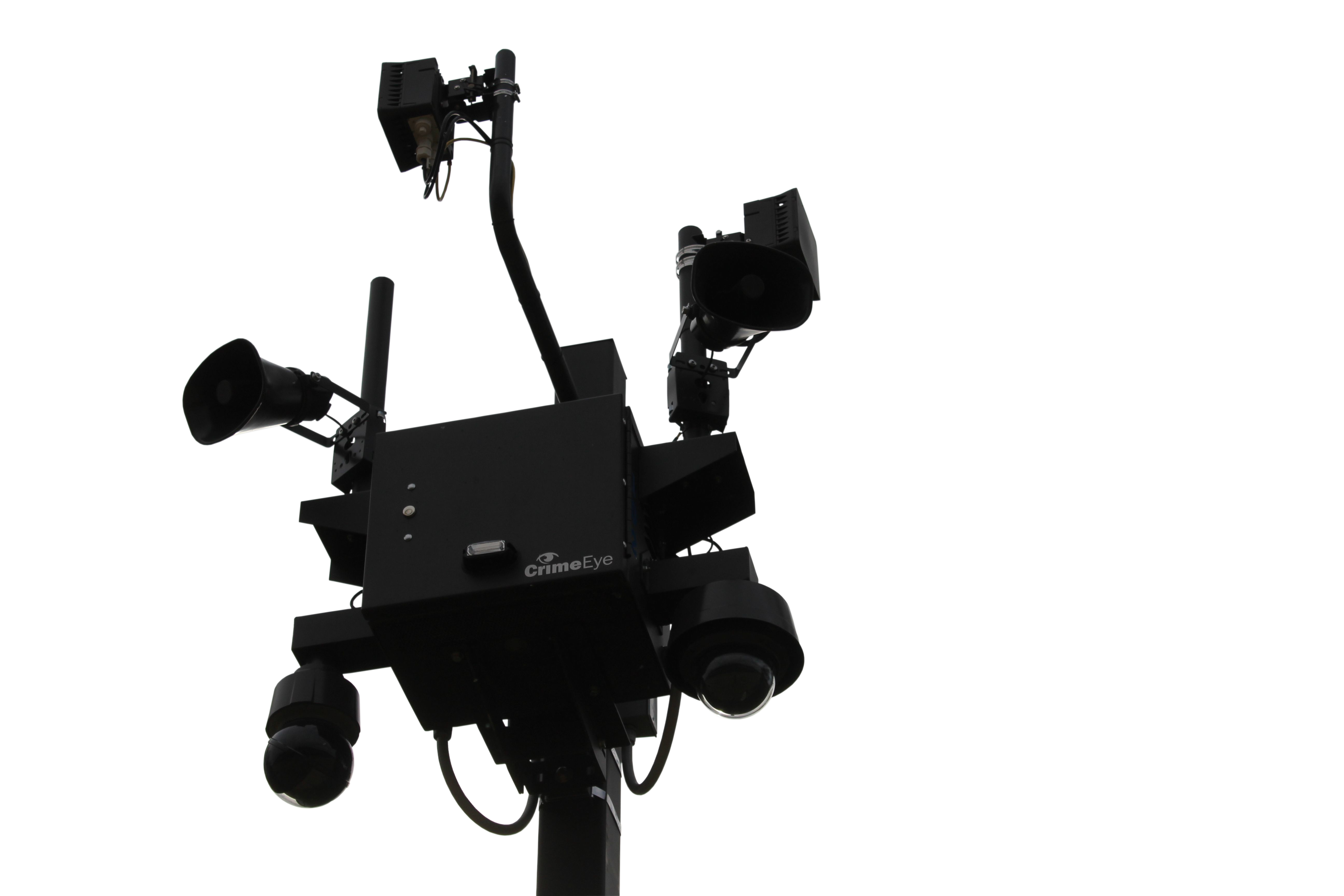
Does posting it here work or would you like it on Mega?
I'll do the cop in the morning, I have to be up early tomorrow.
Inspirational image I saw on twitter. I know nothing about the group featured, but would like to emulate this picture at some point if I see a good opportunity
I saw a lot of that in Australia. People just go crazy with posters and wheat paste. They cover the entire fence, or the entire side of a building with those things.
@ND - Lawrence FL Great work! Thank you!
@PC - Jesse CO Do it.
Do posters apply well to concrete? If so I can come up with some nice spots
If it's flat concrete like you see on overpass supports, yes they do.
I've done it before. I'm not sure if theystayed up for long though.
Farmington AR Oct
Foley AL Oct
Furman University Greenville SC Oct
Georgetown University Washington DC Oct
Gloucester City NJ Oct
Gloucester VA Oct TWO
Greenport NY Oct
Greenville SC Oct
Hancock MD Oct
Hayes VA Oct
Milford PA Oct
Minneapolis MN Oct
Montgomery PA Oct
Muncy PA Oct TWO
Newport News VA Oct FIVE
North Beach MD Oct THREE
North Beach MD Oct TWO
Owings MD Oct THREE
Owings MD Oct TWO
Randolph VT Oct
Rolling Prairie IN Oct
Saratoga Springs UT Oct
Scotrun PA Oct TWO
Simpsonville KY Oct
Slingerlands NY Oct
Sloatsburg NY Oct
South Royalton VT Oct
Westville NJ Oct28
Someone should make a few of these. @PC - Jesse CO
I’ll try my hand at one, and find some volunteers
Simple series of images layered in photoshop, then I put it into an online gif maker. One image per frame. 30 fps.
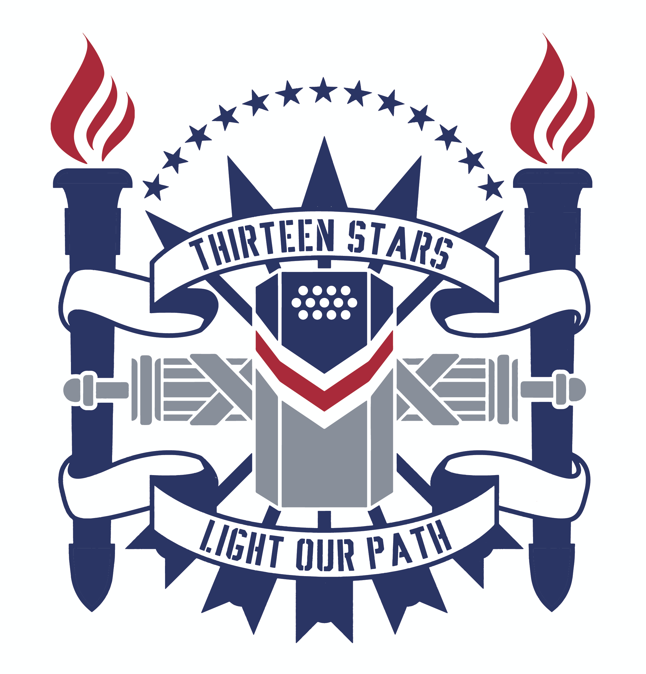
Thirteen Stars Light Our Path copy.jpg
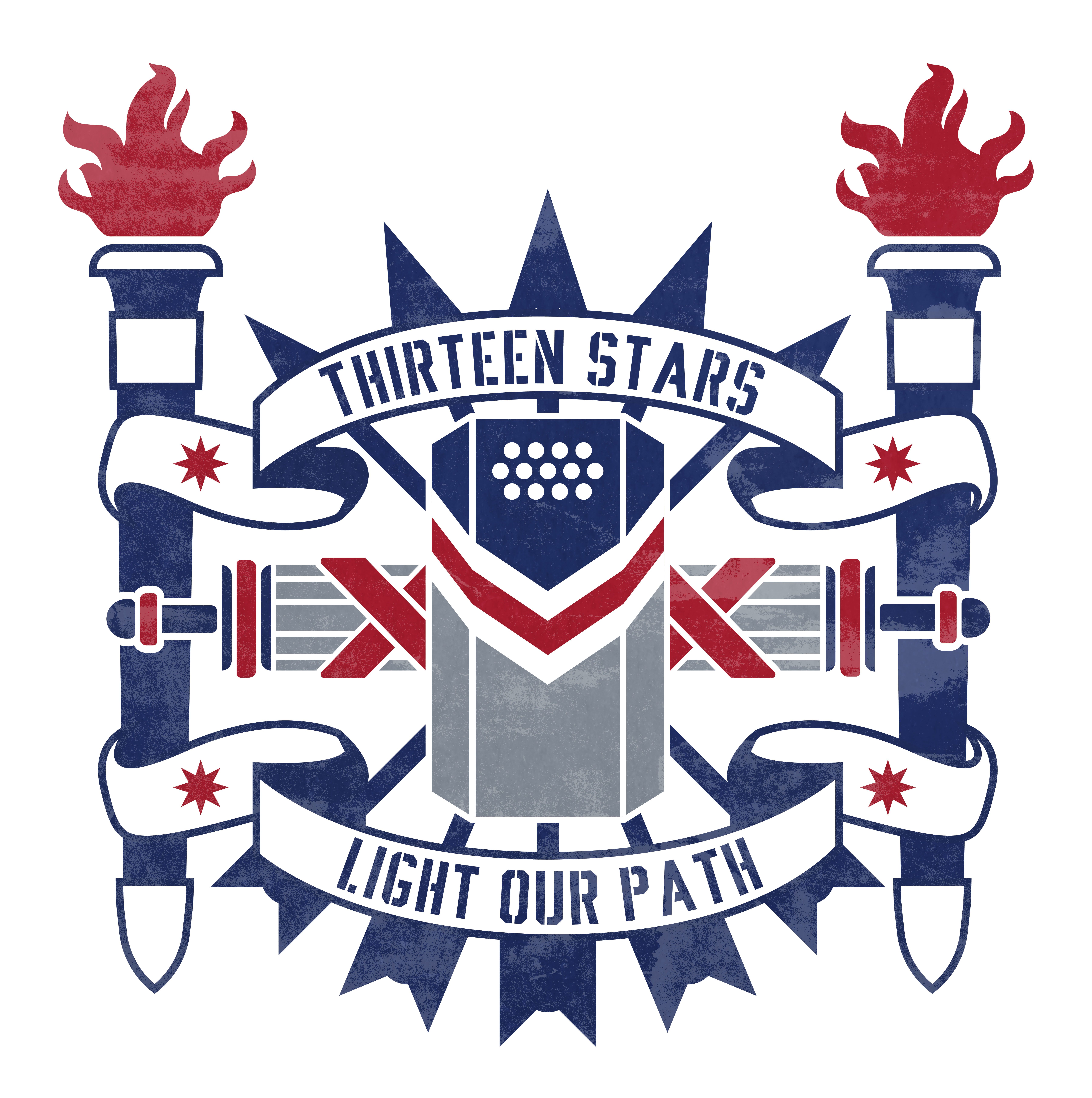
Not sure if I like this or not. Just kept throwing stuff at the canvas until it felt alright enough to take a break.
That looks really cool
@Ben MD @Benjamin MI Thoughts?
Eagle.png

I like it though. Very cool design
I figured it would be redundant since there's already 13 viewports in the shield representing those stars.
(intention design choice)
Didn't even realize that
Thought the words were interesting because when braced, we literally see our path through the thirteen stars.
I like the design. You could replace the torches with fasces and get rid of it behind the shield. Just don't know if there will be too much empty space if you removed the fasces is all. I think "forge our path" works as a better slogan, "light our path" also works however
@Benjamin MI Maybe, although I do want to avoid too much blank space. May delete the fasces. I wanted to touch on the aspect of navigation, the North Star historically brought our people across the sea, as well as other constellations. We are guided by a new constellation today that bears thirteen stars.
I agree on avoiding black space. If it looks odd without the fasces then I would put it back in. I do like how the fasces looks like its connecting the two torches, holding it steady
Also, @Thomas idk if you care but it is slightly off center. Torches are good but the shield-arrows-banners are slightly off to the right
Am aware
This would be a cool album cover
Band name: The Founding Sons
i definitely like it better with the thirteen start atop. once I read it I did notice there were 13 holes in the shield, which I really like and think small details like that actually have metaphysical meaning. Love the design overall. My suggestions would be to simplify the elements, it is a busy image. For example, make the fasces all the same color so its clear it is a single object. same with the torches
It's kind of supposed to be one of those busier, more ornate styles. Reminiscent of traditional architectural pieces I've seen. I'll crop out just the shield for something after it's done.
13stars_light.png
Not a huge fan of the flames there. Too modern. Reminds me of the Ted Cruz presidential campaign logo.
just my 2 cents, $1.50 adjusted for inflation
I can get along with the stars overtop, maybe a simpler fasces design, but the torches are fine for me atm.
ColumbusOHStateCap-44.jpg
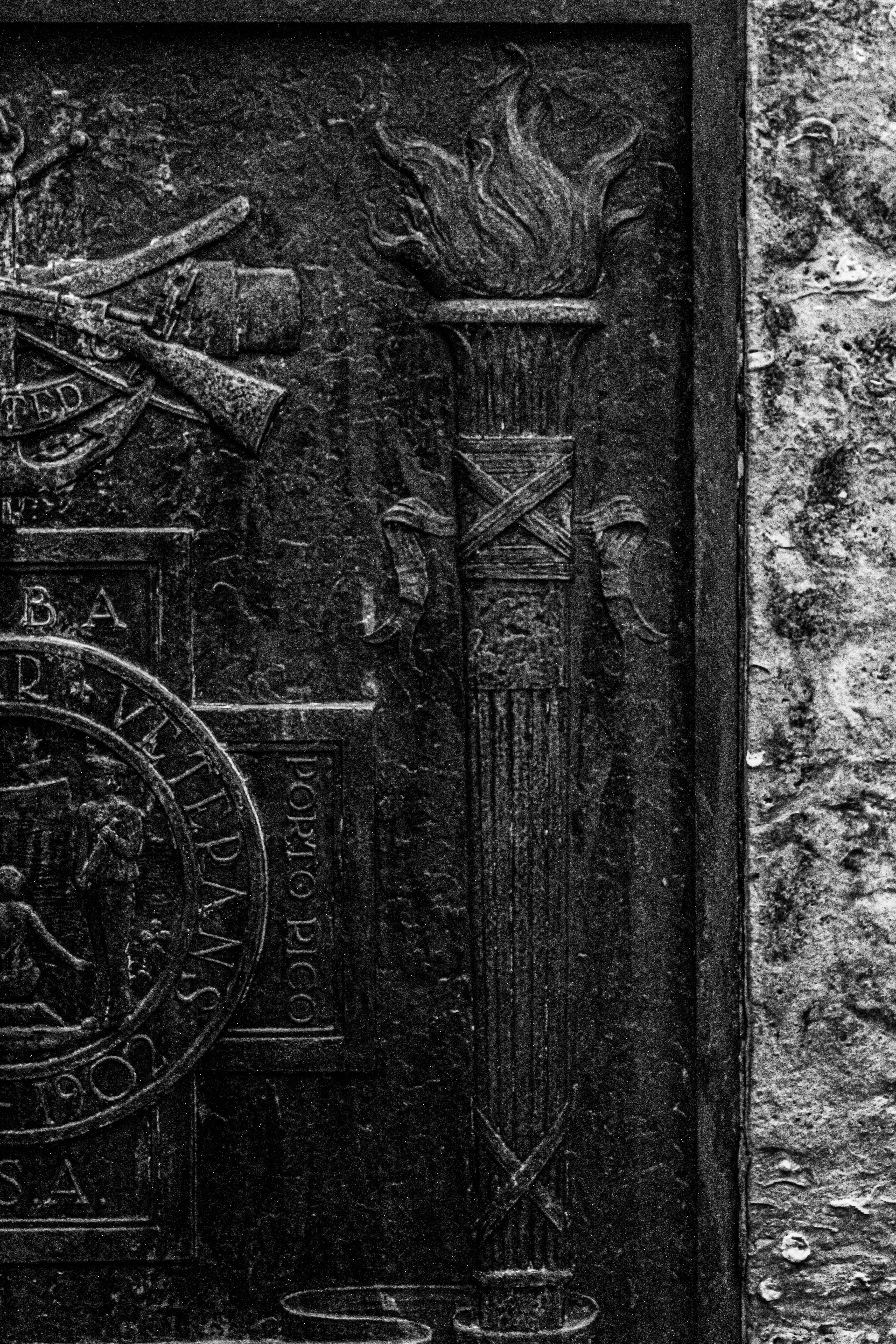
This was my reference for the torch.
The difference between bad and good artistry is concealing the places you stole from.
I like those flames on that torch
more aggressive
I prefer the first flames. I like the stars on top. Im not sure about how I feel about the entire fasces being gray
not finished 1 .jpg

I really like the texture on the gray. This is a cool version
I used a photo of sheet steel as a texture layer.
Screen Shot 2021-12-14 at 6.41.10 PM.png
@Thomas Is there a specific meaning behind the 5 arrows (not arrows in general but 5 arrows specifically) in some of the designs you've made? I saw somebody on 4chan accusing it of being a use of the Rothschild family logo and I wasn't immediately able to find any other symbolism about it relating specifically to America.
The Great Seal has a bundle of 13 arrows, and in more sleek designs 13 is a bit hard to showcase. However, a bundle of arrows still caries the meaning of the fasces, the phalanx, order and striking power. 5 is just a nice symmetrical way to showcase it.
Technically, it could be six as is with our NW badge, resembling the six original members of every NW, but these are symbolism minutiae.
If you want to be all interwar European, the Spanish Falange also used 5 arrows and a yoke as their symbol. Their ideals not entirely incongruous to ours. Convergent evolution, not inspiration.
Yeah, I mentioned the Falange and he immediately went into even wilder territory by implying that the Falangists used it for the same reason and were also secretly serving the Rothschilds lol.
I reallly like the new design
a lot
@all What about that extra blue outline? How do we feel about that?
I think it looks better without it.
I don't think it matters that much, but I'd say to include the outline.
@Tyler CT @Walter ID Fight.
:boxing_glove:
I think it's unnecessary for anything except maybe the head and the shield. The rest of it is well defined enough without it.
I like the outline
I added some new shadows and removed the outline. 180IQ centrist play.
FINAL
Thomas wait don't print thousands of copies of that! There's a red line!
It's to keep people from printing their own. Your home dog needs to buy tuna cans.
That looks good
Have you seen my box truck
@Alexander PA No, that conversation was more like, "what the hell happened and how soon can you get the truck to pickup?"
That sucked big time but nobody can deny how awesome it was riding back and group singing sea shantys into the face of adversity.
Y'all sang shanties? Dang I was clearly in the wrong truckload.
@Walter ID The last faithful rearguard get all the best.
Rushing to be on the first box truck out < Reluctantly leaving only after remaining steadfast until all your brothers depart safely
Second.
Isle of Wight VA Nov
Jacques ID Nov
Jenks OK Oct
Joliet IL Nov TWO
Joliet IL Nov
Kansas City MO Nov
Kathleen FL Nov
Kenosha WI Nov
Kilmarnock VA Nov
Kimball MN Nov10
I did enjoy singing "By God we'll have our home again"
135 total messages. Viewing 100 per page.
Page 1/2
| Next